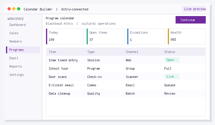
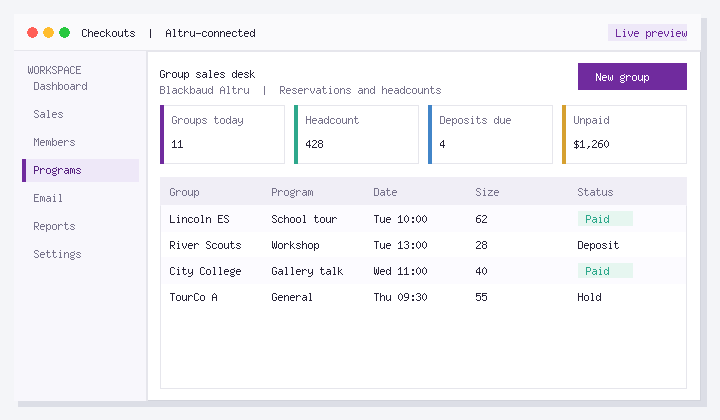
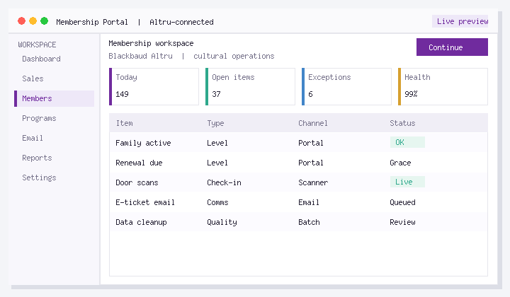
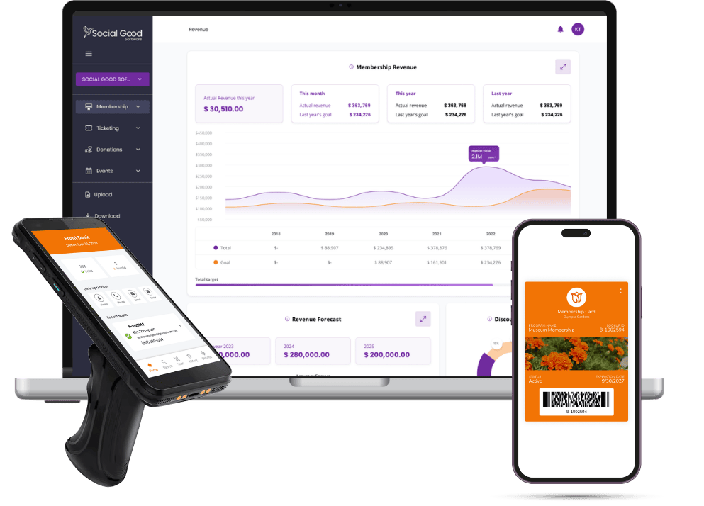
The Daily Sales screen is where your cashiers spend their whole shift, so its layout matters more than almost any other Altru setting. A ticket seller who has to hunt for “Child Admission” behind three rows of program buttons is slower, makes more mistakes, and rings up the wrong price more often. The good news is that most of the improvement comes from planning the layout before you touch the configuration, not from anything hidden in the software.
This guide covers how to think about button layout, what to do about different staff needing different screens, and how to handle general admission when the defaults don’t behave the way you’d expect.
Start on paper, not in Altru
Before you change anything, pull a few weeks of daily sales and list what your cashiers actually sell, in order of frequency. For most museums, gardens and zoos the list looks something like this:
- General admission by price type (adult, child, senior, member)
- Membership purchases and renewals at the desk
- One or two timed programs or add-ons (a film, a special exhibit, a tour)
- Donations and round-ups
- Everything else: parking, rentals, occasional events
That ranking is your layout. The top two or three items belong in the first positions a cashier sees. Things sold a few times a month should not take up prime space, even if they’re important to a particular department.
Sketch the screen as a grid and have one experienced cashier react to it. They’ll tell you in five minutes which buttons they reach for most and which ones they never touch.
Configuring the buttons
Daily Sales layout is managed in Altru’s daily sales configuration area, where you choose which programs, events, memberships, donations and other items appear as buttons and in what order. Exact screen names and options vary by release, so if something below doesn’t match what you see, check Blackbaud’s current documentation or ask support rather than assuming it isn’t possible.
A few habits that help regardless of version:
- Name things for cashiers, not for reports. A program called “GA-2026-Standard-Weekday” is fine in a query but slow to read at a register. Use short, plain button names.
- Group by what happens together. Put admission and the add-ons usually sold with it next to each other, so a family transaction doesn’t require scrolling.
- Retire seasonal buttons on a schedule. Last winter’s holiday event button sitting in the middle of the screen in June is a common source of mis-rings. Put a calendar reminder on whoever owns the configuration.
- Change one thing at a time. Rearranging the whole screen the morning of a school-group day is how you end up with a line out the door. Make changes before opening and tell the desk what moved.
Different staff, different screens
A membership desk, a general admission register and a special-events table rarely need the same buttons. The question is whether your Altru setup can present a different layout to each.
Be careful here. Whether Altru supports truly per-user or per-station layouts, and how granular that is, is something to confirm in your own environment before you design around it. Test in a sandbox or before opening: log in as two different staff accounts and see whether the screen differs. If it doesn’t, these workarounds are what most teams use:
- Design one shared layout with clear zones. Admission on one side, memberships in the middle, programs and events on the other. Staff learn to ignore the zones that aren’t theirs.
- Use security roles to limit what people can do, even if you can’t limit what they see. That keeps a seasonal ticket seller from processing a membership change they aren’t trained for.
- Drop buttons for rarely sold items. If an item sells a few times a month, check whether cashiers can reach it another way in your version (for example, by searching or browsing) rather than giving it a permanent button. Fewer buttons usually beats perfectly tailored buttons.
General admission and default buttons
The most common frustration is general admission. Teams want the admission price types to appear automatically and in a consistent place, the same way some other items can be set as defaults. In practice, admission doesn’t always offer the same default-button behavior as other item types, and admission buttons may not display the way you’d want out of the box.
If that’s what you’re running into, a few things to try:
- Confirm how your admission is set up. Whether general admission is configured as a daily admission program or as a scheduled program affects which display and default options are available. Switching admission from one program type to the other is sometimes suggested as a way to get more control over how it appears, but it also changes how capacity and reporting work, so test it in a sandbox and confirm the effects with Blackbaud support before changing anything live.
- Place admission first and leave it there. Even without a “default” flag, a fixed position that never changes gets you most of the benefit. Cashiers build muscle memory fast.
- Check whether duplicate or repeating buttons are needed at all. Some teams want the same admission button to appear in several places on the screen. If your version doesn’t allow repeats, a tighter layout with admission at the top usually solves the underlying problem.
- Ask Blackbaud support directly what your release supports for daily admission display. Give them the specific behavior you want; you’ll get a faster, clearer answer than a general question.
Keep a reference copy
Once the layout works, take a screenshot and save it with a one-page note: what each zone is for, who owns changes, and when seasonal buttons come off. When a new manager or a rushed volunteer rearranges things, you’ll have something to restore from. It also makes training new cashiers much easier, because you can hand them a picture of the screen before their first shift.
Quick answers
Will rearranging buttons change my reports?
Layout changes affect how items appear to cashiers, not how sales are recorded. Changing the underlying program, price types or item setup is a different matter and can affect reporting.
How often should we review the layout?
At each season change and whenever you add or retire a program. A short review before summer and before the holidays catches most problems.