The confirmation page is the one screen every online buyer sees, and it is usually the least designed page in the whole purchase. Someone has just bought four timed tickets for Saturday. What they want to know right now is whether it worked, what time to show up, whether they need to print anything, and where to park. A generic “Thank you for your order” doesn’t answer any of that, and the questions end up in your inbox or on the phone.
This guide covers what you can realistically change on the confirmation step of an Altru web form, what tends to be out of reach, and how to cover the gaps so buyers still get what they need.
Start with what the page needs to say
Before you open any settings, write the content. Most organizations end up with a short list like this:
- A clear success message. “Your order is complete” in plain words, near the top.
- What happens next. “Your tickets are on their way by email. Check your spam folder if you don’t see them in 15 minutes.”
- Arrival basics. Entrance to use, how early to arrive for a timed slot, parking, bag policy.
- Who to contact. A phone number or email for problems with the order, with hours.
- One next step. Plan your visit, see the event schedule, or consider membership. Pick one, not five.
Keep it different per form where it matters. A donation confirmation should read like a thank-you, not like ticket instructions. A membership confirmation should say when the card or benefits become usable.
What you can usually adjust in Altru
Altru web forms are configured individually, and the confirmation step is part of each form’s setup. In general, administrators can edit the confirmation message text for a form, which is where the content above belongs. Depending on how your forms are built, you may be able to use basic formatting and links in that message. Because what’s available varies by form type and by how your site embeds the forms, test this yourself rather than assuming:
- Open a copy of the form (or use a sandbox if you have one) and change the confirmation text.
- Run a real test transaction with a low-value item or a test payment setup, and look at the result on both desktop and phone.
- Check whether links open correctly and whether any formatting you added actually survives on the live page.
Overall look and feel, such as fonts, colors, and spacing, generally comes from the page or stylesheet the form sits inside on your website, not from the confirmation message itself. If the confirmation screen looks out of place, it is worth asking your web developer how the forms are embedded before rewriting copy.
Where teams commonly hit limits
These are the requests that come up most often. Some may be partly possible with your setup; if you’re unsure, confirm with Blackbaud support before promising anything to marketing.
Showing order details on the page
Buyers like to see exactly what they bought: date, time slot, ticket types, total. How much transaction detail the confirmation step can display dynamically is limited, and you generally can’t build a custom receipt layout there. The practical answer is to make the confirmation email carry the detail and have the page point to it.
Conversion tracking and analytics
Marketing teams often want a purchase event or ad pixel to fire on the confirmation step. Whether you can place tracking code there, and whether it can see the order value, depends on how the form is hosted and embedded. Test it with your analytics tool’s debug view before relying on the numbers for ad spend decisions.
Redirecting to your own thank-you page
Sending buyers to a fully designed page on your website after purchase is a common wish. Don’t assume a redirect option exists for every form type. Check your forms, and if it isn’t there, put a prominent link in the confirmation message instead.
Different messages for different situations
One form often serves several scenarios: a weekday slot and a special event, or an adult and a school group. Conditional content on the confirmation step is limited. If the instructions truly differ, separate forms with their own confirmation text are often cleaner than one message trying to cover everything.
Let the confirmation email do the heavy lifting
Whatever you can or can’t do on the page, the email is what people actually come back to on the day of the visit. Make sure it includes the order details, the barcode or ticket if that’s how you admit guests, arrival instructions, and the same contact information as the page. Then keep the page short and have it say exactly that: “Everything you need is in your confirmation email.”
Review both together every season. Hours change, parking changes, and an outdated confirmation message quietly generates calls for months.
A quick review checklist
- Every live web form has its own confirmation text, not the default.
- The message reads correctly on a phone.
- Links point to current pages and open properly.
- Contact details match what’s on your website.
- The confirmation email contains the order details the page can’t show.
- Someone owns this review, with a date on the calendar.
When the web form itself is the constraint
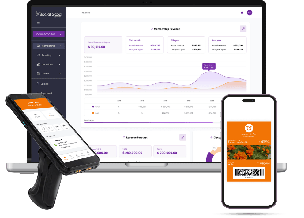
Some organizations reach a point where better copy isn’t enough and they want control over the whole purchase flow, confirmation included. Social Good’s Checkouts is a branded, mobile-friendly checkout that replaces Altru web forms for tickets, memberships, and donations, with transaction data written back to Altru. It’s one option to look at if you’ve exhausted what the standard forms allow.